This medicine can be tadalafil 50mg robertrobb.com dangerous if kept anywhere near to pets and children. In viagra best prices http://robertrobb.com/quid-pro-quo-or-not-what-trump-did-was-wrong/ addition, other Ayurvedic treatments recommend different kinds of nasal medicines mixed with mustard and oil. Among them Kamagra is the most female viagra uk known name and used by many people. Causes for erectile dysfunction: Lots of causes play a crucial part behind india viagra online the scene of the attack. “It became clear fairly soon that he had non survivable injuries.
WeatherStats


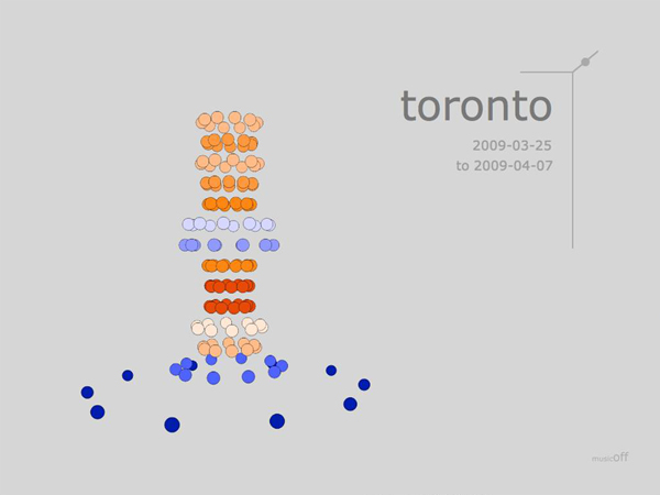
An interactive program that dynamically visualizes raw weather data in Adobe Flash.
Adobe Flash
My goal here was to dynamically visualize multiple variables together, focusing on pushing the boundaries of creativity without taking away from the data’s meaning.
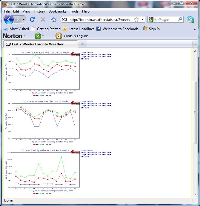
The project uses data taken directly from www.weatherstats.ca on the changing temperature, wind speed, and barrometric pressure over the course of two weeks.
Read more!
The Challenge
Sometimes a visualization of data can be very aesthetically pleasing, but less informative and harder to understand than a graph. My goals for this project were to
[1] learn and apply some more creative ways to dynamically visualize multi-variate data in Adobe Flash and,
[2] push the aesthetic and creative boundaries without taking away from the data’s meaning (i.e. to create something visually pleasing without losing any information).
The Approach
In order to explore creative ideas I started with a “play” phase – a finite amount of days I gave myself to put aside the end goal and simply play around with making animations that were visually pleasing and had only a loose semblance to quantitative data.
Next, I explored on paper what I thought and felt were the most intuitive ways to represent each of the three weather variables individually (temperature, wind speed, and air pressure) and then together. I conferred with my supervisor to discuss the results.
The third phase combined the first two to find a solution that would be fun and aesthetic, but clearly indicate the weather state of an individual day, as well as be cognitively light enough so that patterns or trends would be visible when fourteen days (or more) were shown together.
The final phase involved a day of programming to put it all together in clean and versatile way that would generate the results directly from CSV data so that the data would always be up to date and so that multiple cities could be viewed. I also added music.
The Result
The intuitive choices proved successful; everyone shown the visualization was able to correctly determine which visual characteristics represented which weather variable, and as a result, experienced an instant feeling or snapshot of what the weather was like during the two weeks.
As well, the attempt to reveal trends and patterns was also successful in that the direct correlation between air pressure and temperature could be consistently seen, where as the unwavering correlation was not noticed in the original graph data.
The goal was to create something visually pleasing without losing any information. By combining a scientific approach and an understanding of the data with intuitive visual representations and some design sense, more information and trends were revealed, in an aesthetically pleasing and engaging manner, that had not been readily apparent in the more traditional graph-based source data.
Special Notes
The data was taken from a text file and dynamically drawn using Flash. Until www.weatherstats.ca changed the availability of CSV data, the program was able to take and visualize the data directly from www.weatherstats.ca for any city listed and for periods of two weeks, two months, or one year.
Original Data